Using graphics to spark compliance email joy.
Want another way to have a big impact on your compliance email engagement? This blog post is for you.
Something as simple as a few well-placed, well-intentioned, iconic graphics could have a massive impact on whether folks read—and, more importantly, retain—your emails. Plus, graphics are fun!
Here are some tips on how to elevate your emails using graphics.
Minimalism is your friend.
First up are all those things that graphic designers wish everyone else knew about using images in digital communications—all things made possible through a minimalistic approach!
* Image file size: The smaller, the better. In total, your email should not be more than 1 megabyte. That means if you use four graphics, they should be less than 250 kilobytes each (because text also takes up some space).
* Image quantity: As they say, everything in moderation. Too many images can distract from your message. A good rule of thumb for beginner graphics users is to stick with one image per section/topic.
* Image editing: If you're having trouble finding appropriately sized images, try an image compression tool. And no matter what, don't use those full-resolution DSLR pics—they're gorgeous, but HUUUUGE.
* Image style: Ideally, the images you use in a single email should be stylistically similar—your reader's brain won't subconsciously be skipping among styles, trying to understand how they're related. An easy way to do this is to have minimal artwork: the more minimal your artwork, the easier it is to create a unified visual theme.
You already know about our exclusive icon system—graphic representations of compliance concepts that simplify messaging in a memorable way. Our icons were created explicitly to make it easier for your teams to recognize and understand all things compliance in one simple image ... they're the perfect encapsulation of the idea that minimalism is your friend.
 If these icons were a person, they'd be Marie Kondo.
Plus, not only was this visual language designed with compliance best practices in mind, but with technical best practices, too: file sizes are manageable, they're easily editable, and they're stylistically consistent.
And if you want to take things to the next minimalist level, we gotchu! Our icons have all been designed as line-art versions, too.
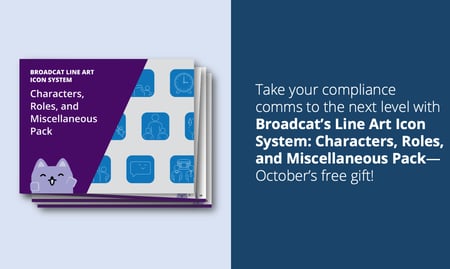
 The Characters, Roles, and Miscellaneous Pack is our free gift to Compliance Design Club Members for October 2020—grab yours before the end of the month!
Okay, okay. We know what you're thinking ... "But what about Broadcat?"
And yes, you're right. We kinda (read: totally) break these rules. Guilty as charged. That's why ...
Maximalism isn't always your enemy.
Here's the thing: this rule-breaking works for our brand. Our image-heavy vibe is part of our identity. We're all about fresh memes and '90s GIFs because we strive to make compliance highly accessible—and fun! Plus, images (animated or otherwise) can be super powerful when we're making points that may be new or (potentially) controversial for our industry.
And maybe that's your brand, too. All that to say ....
Proceed with caution. Our style isn't for everyone. For example, can you imagine Warren Buffett sharing 🔥 memes in Berkshire Hathaway's shareholders' letter? Not really.
 Wrong Buffett.
So, if you work at a company whose branding guidelines include the words "pre-Y2K-Nickelodeon," you can probably get away with this stuff. Otherwise, err on the side of minimalism.
Alt text: email's unsung hero.
Alt text is über important for anyone who either has a visual impairment or whose images are blocked. In these cases, you'll need to make sure that there's some descriptive text where the image should be. That way, your recipients can mentally visualize the image, or at least get some context as to what's meant to be in that blank space.
Not sure how to do it? Here's how to add alt text in Outlook.
When to think twice.
When you hear "graphics," you may think of things other than icons or images approved by your marketing team. Here are a couple of examples where you should think twice before adding them willy-nilly to emails:
* Emojis: One or two well-placed emojis that emphasize your point—and align with your branding—are fine, but don't clutter your email with them. Also, be mindful of whether using an emoji would imply the wrong emotion: does it come across as dismissive or sarcastic?
* Clip art: Unless it was made specifically for your company, just say no. 🙅 ( ⬅️ well-placed emoji example!)
* Stock photos: Take a similar approach to clip art. Your company might have a collection of stock photos they've purchased (or had commissioned) for internal use, and if that's the case, go for it! In all other cases, steer clear. Stock photos don't have the best reputation, and like we've discussed before, they can give folks the wrong message (check out #2).
Less is more.
If you're still stuck on your maximalist email ways (In which case, hi! 👋 Have you met us? We don't blame you.), one of our favorite resources for inspiration is Really Good Emails. They're mostly B2C stuff, but some browsing might lead you to some interesting samples.
Now go forth and put in minimal effort!
 You know what we mean!
P.S. Want other tips on making your compliance emails the best that they can be? Check out our tips on writing fantastic compliance newsletters and sending newsletters that your teams actually want to open.

