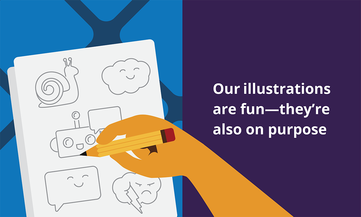

If you’ve read about our design process, you’ve seen that we approach developing our materials with a lot of intention. So it shouldn’t surprise you that our designers like to draw with intention as well.
We’ve heard all kinds of reactions about the illustrations in our materials, and we’ve rounded up our responses to the most common to give you another peek into just how much we think about these things.
 ✨ Graphic design is my passion ✨ | Source: Seinfeld
“How fun!”
Let’s be honest—compliance has a reputation for being authoritarian and dry. And some of the topics we have to cover can be difficult to parse—even for lawyers. That's why we use illustrations: they support the content by clarifying the message.
And that’s also why we’re not simply stamping a cat drawing onto a Code of Conduct and calling it “fun.” We strategically use a combination of design elements, often inspired by kawaii (a Japanese cultural aesthetic) and Disney’s 12 animation principles, throughout our illustrations and icons to elicit delight. Here are some of them:

Soft, rounded shapes instead of rigid lines and corners represent the organic shapes we're familiar with from everyday life (apart from a piece of paper or computer screen). 🌀
Analog references and exaggeration elicit emotions like nostalgia and surprise. ⏰
Anticipation and movement depicted by staging inspire action, which also aligns with our writing style. 🍃
“It looks so engaging!”
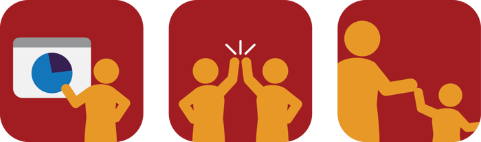
By design, each icon and illustration is simple and directly related to the words beside them, which helps people process and remember the content more easily. Our work isn’t necessarily engaging because it’s fun and exciting; it’s engaging because it’s useful to the reader. Employees don’t need us to pull out all the stops and whistles to get their attention—they just want us to respect them and their time by providing effective content.
 R-E-S-P-C-P-T | Source: The Office
“It’s different from what I normally see…”
Some people gravitate toward images, some people prefer to read. Most people fall somewhere in between, but one thing is certain: everyone consumes information differently. That's why our materials rely on both images AND text to support and complement each other.
We also take a host of other factors into consideration to make sure we’re including everyone. ⬇️
Our entire color system for our icons and job aids has been checked against color blind accessibility standards.
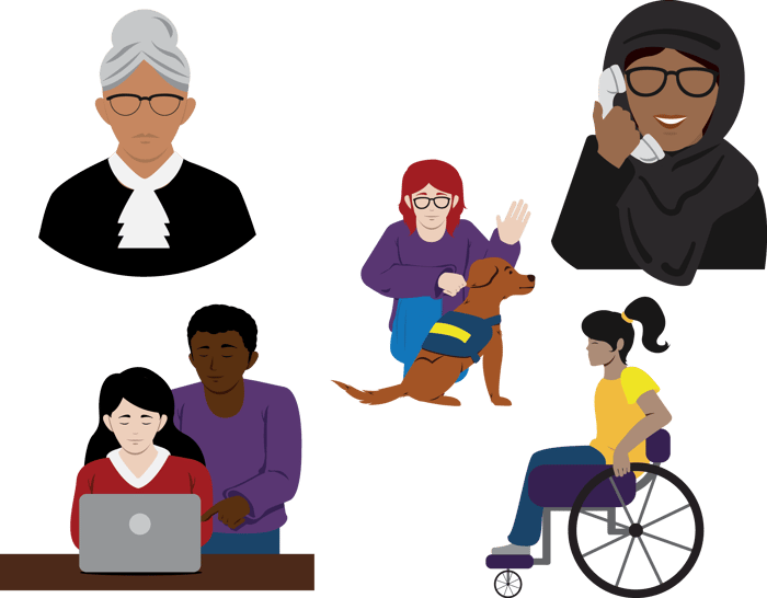
The shapes we use in our designs are meant to be inclusive. For example, we use generic clothing in our illustrations of people to avoid implying a specific gender. We also make sure to avoid negative connotations on one particular demographic when providing examples of noncompliant behaviors.
The exception to the above rule is for our materials that cover inclusion. For those, we leverage a more realistic style to represent differences in skin tone, hair, size, ability, etc., just as we'd see out in the world.
“My kid would love this!”
Of course, we take this as a compliment, because our materials can benefit everyone (even little ones)! 👶

But we’ve also heard this as a critique that our style can be interpreted as irreverent or cartoony. While we're intentionally trying to disrupt industry patterns and change behavior, we always respectfully consider the specific emotion we’re trying to convey depending on the context.
For example, here's a peek into our process for The Helpline Chronicles.
The Helpline Chronicles originally started as Tales from the Helpline. During the design process we realized it was a bit... whimsical. We were concerned it could be inappropriate if the template was filled in with real examples of sensitive issues that people had experienced in a company. Instead of starting from scratch, we created a more neutral tone by replacing some of the more emotive illustrations and adjusted the color palette to something more monochromatic. That’s how The Helpline Chronicles was born!
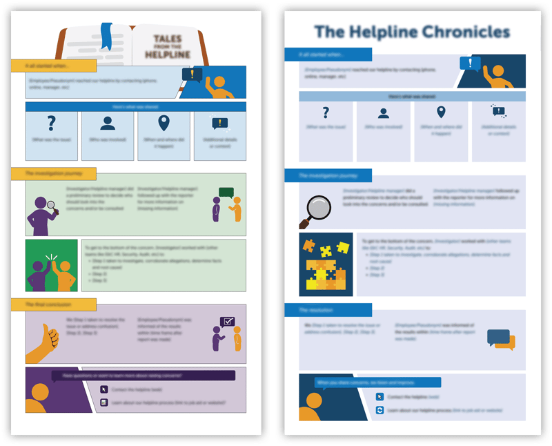
How it started and how it ended
“It’s just not our style…”
If this style doesn’t resonate with you and your organization, that’s OK! We understand compliance communications aren't one-size-fits-all and we’re ready to meet you where you are. We offer customization of all our materials to fit your branding, and can work with you to create bespoke materials designed just for your organization!
 We're here for you! | Source: Academy Awards