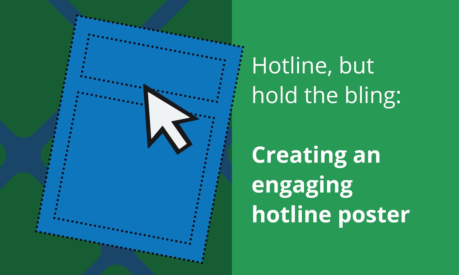

Apologies to Drake, but the best hotline posters are the ones that keep it simple. The less bling, the better.
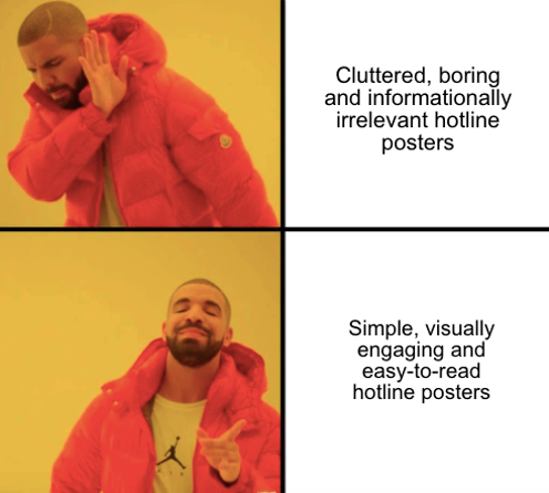 An effective hotline poster empowers your colleagues to follow their conscience. People want to do the right thing, and as ethics and compliance professionals, it's our job to help them. And it may be counterintuitive, but the best way to do that is through minimalist design and limited information.
Hear us out.
1. Clutter is your enemy.
Honesty check: How many of us actually read the notices on the breakroom bulletin board? 😬
Exactly. Those things are notoriously cluttered, ill-designed, and hidden away in some dark corner of the room ...
... And, if you're not in control of placement, that's exactly where the hotline poster is going to end up.
 Whomp whomp.
If it’s a challenge to get people to see your poster—much less read it—you have to make it eye-catching:
* If the break room bulletin board is a seizure-inducing collection of multicolor papers, try one large monochromatic poster.
* Is it a bunch of OSHA/EEOC/etc. bulletins with the requisite red, white, and blue color scheme? Try some neon accents (just don’t go full ‘80s—unless that's your brand, of course).
If you do have the option of selecting the location of your poster, make sure it’s a) in a prominent area that people see every day, and b) well-designed, so that folks don’t mind seeing it every day.
And speaking of things you don’t want to see every day …
2. Stock photos are boring.
Nothing says, "I don't care" quite like a sad stock photo or a cheesy inspirational poster. You're trying to engage people's humanity, not make them roll their eyes. As we say at Broadcat, the problem employees have with "corporate compliance" isn't the "compliance" part—it's the "corporate" part.
 Don't let celebrities fool you: An ironic stock photo is still a stock photo.
Hotline posters exist because we care about our colleagues and our companies, as well as the customers and clients we serve. So pick images that indicate that you're trying, not phoning it in.
Can that be a stock photo? Yeah, of course. There are some really good ones out there; just be mindful when selecting which ones to use. Alternatively, opt for a simple abstract design to avoid photography altogether. We've got some free versions that make it super easy—go try 'em out.
3. Your audience is the real MVP. Treat them that way.
Raise your hand if you like to feel threatened at work. 🙋
Yeah, that’s what we thought. Generally speaking, the folks you work with are a) responsible and b) want to do a good job. They’ll be discouraged if a hotline poster sounds threatening or negative, so make it approachable—even aspirational. You want to encourage reporting, not bully people into silence.
So when you're starting to create your hotline poster, ask yourself two questions: 1) What outcome am I trying to accomplish, and 2) What emotion should I evoke to accomplish it? With those questions in mind, you’re ready to develop your messaging, including the images you use.
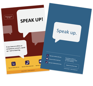
So, for instance, if you want to empower and reassure folks as they report compliance issues, don’t opt for “Compliance concerns affect all of us because they endanger the health of the company” with a giant picture of your corporate headquarters behind it. That’s a bit unsettling and pretty darn corporate-speak, right? Instead, try: “If you have an ethics or compliance concern, speak up—we’re listening.” We've got lots of hotline posters and screensavers like this in Compliance Design Club.
4. You don't get bonus points for the number of country codes you include.
One of the worst design offenses for hotline posters is that they tend to be an informational dumping ground. Unless you’re working at the U.N., there’s no reason to overwhelm your readers with contact details and translations that aren't relevant.
Don’t make your audience do the work of wading through content—they’re already stressed enough about reporting an issue! The last thing you want to do is cause analysis paralysis and have a major problem go unreported. So make it as easy as possible to reach out: only include one phone number for your hotline on your poster.
How do you do that when you're a multinational company with different hotline numbers for each country?
Simple: Rather than creating a one-size-fits-all poster with 20 numbers listed, create a single well-designed version that's editable. Your individual markets can then update it for their particular location—easy peasy!
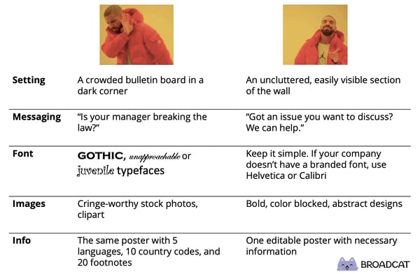
5. TL;DR: here's a chart!
You know how we at Broadcat feel about charts. This seemed like an appropriate time to use one!
Want to see what editable hotline posters look like and how easy they are to edit? Look what we've got for you!