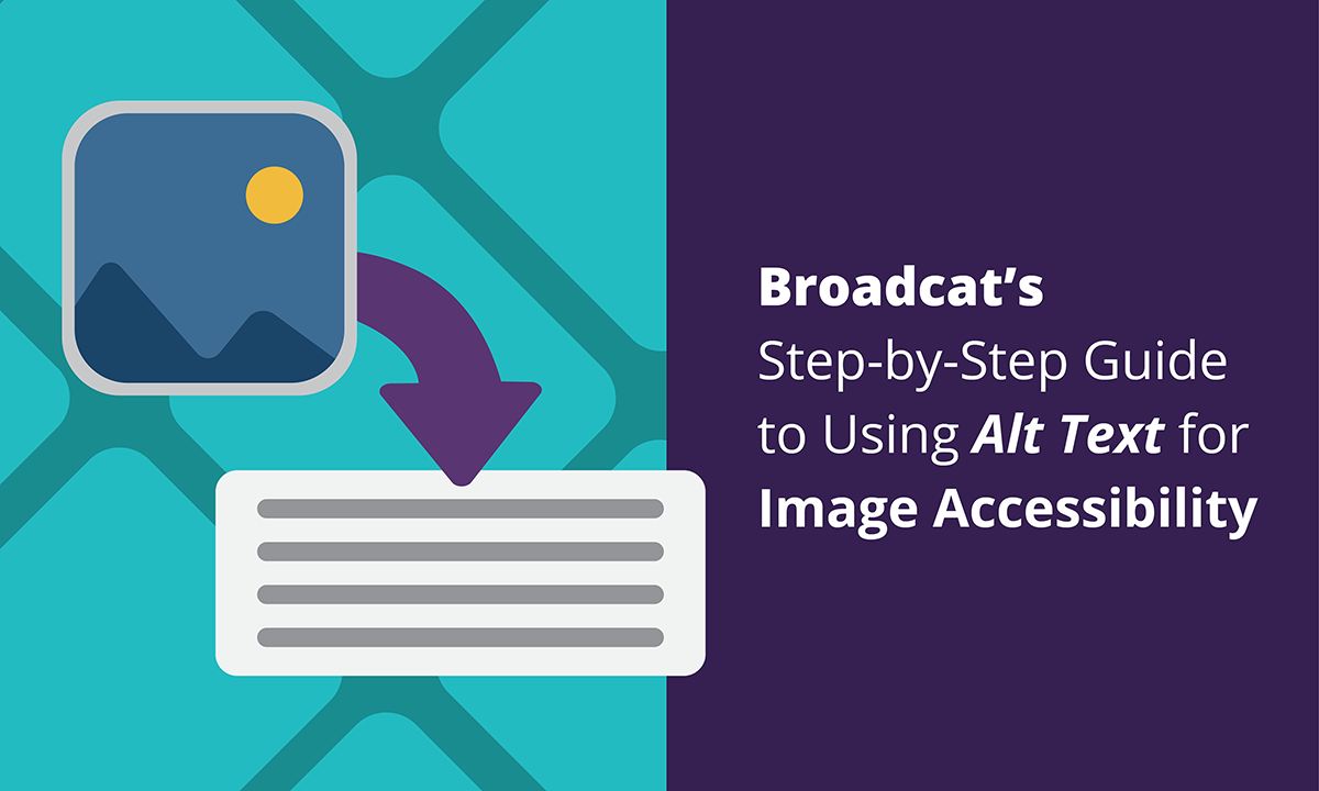

Let’s say you have a job aid that has some really important information on it about privacy policies that you want to share with others in your company. And let’s say this job aid has a lot of graphics on it that contain relevant information: Graphics that would cause employees who rely on screen readers to get only half the story or lose contextual information.
But worry not: You can make sure your job aids are much more accessible for screen readers with alt text! 🌟
Alt text refers to short sentences (written by you!) that describe an image for screen readers. (Another way it’s useful: If you don’t use a screen reader, but an image doesn’t load, alt text appears in its place.) By applying alt text to your images, you can make sure that even if someone can’t see your icons, they’ll still get the visual context they need.
As the Internet’s reliance on images increases, so does the need for alt text.
Alt text is often associated with website images or HTML coding, but you don’t have to be a programmer or designer to use alt text. In fact, one of the most common—and important!—places to add alt text are for images in PowerPoint presentations. (Broadcat insider knowledge: We do it all the time for our job aids! 💡 )
How DO you add alt text into PPT?
Here’s how! And with pictures! That have alt text!
So the first question is how do you write alt text? 🤔 There are no actual rules, but I’ve been implementing alt text for about a year now, and here are some tips and tricks that I’ve learned along the way:
- Don’t start your alt text with the words “image” or “icon” or anything like that. The screen reader lets the viewer know before it reads the description that this is an image.
- Try to keep your alt text relatively short. You don’t want your viewer to be stuck listening to a whole paragraph that describes what an image is when they have a whole job aid to review. So exhausting!
- Not every single image needs alt text. If your job aid is heavy on the illustrations, add alt text to the ones that are contextually important or give information or examples. If an image is decorative or a part of the background or just there to look pretty, it can be designated as “decorative” instead so the screen reader can skip right over it.
- Write your alt text as sentences with capitalization and punctuation. Be succinct and always end with a period. This tells the screen reader to pause before it reads the next object or illustration.
- Be specific. Let’s say you have an image of a person shaking hands with another. You could just leave it as “Person shaking hands with another person.” Or, you could provide more clarity by saying something like “Employee shaking hands with their manager.”
So, now that we know how to write it…how do we go about implementing alt text?
Let’s fire up PowerPoint and find out, shall we?
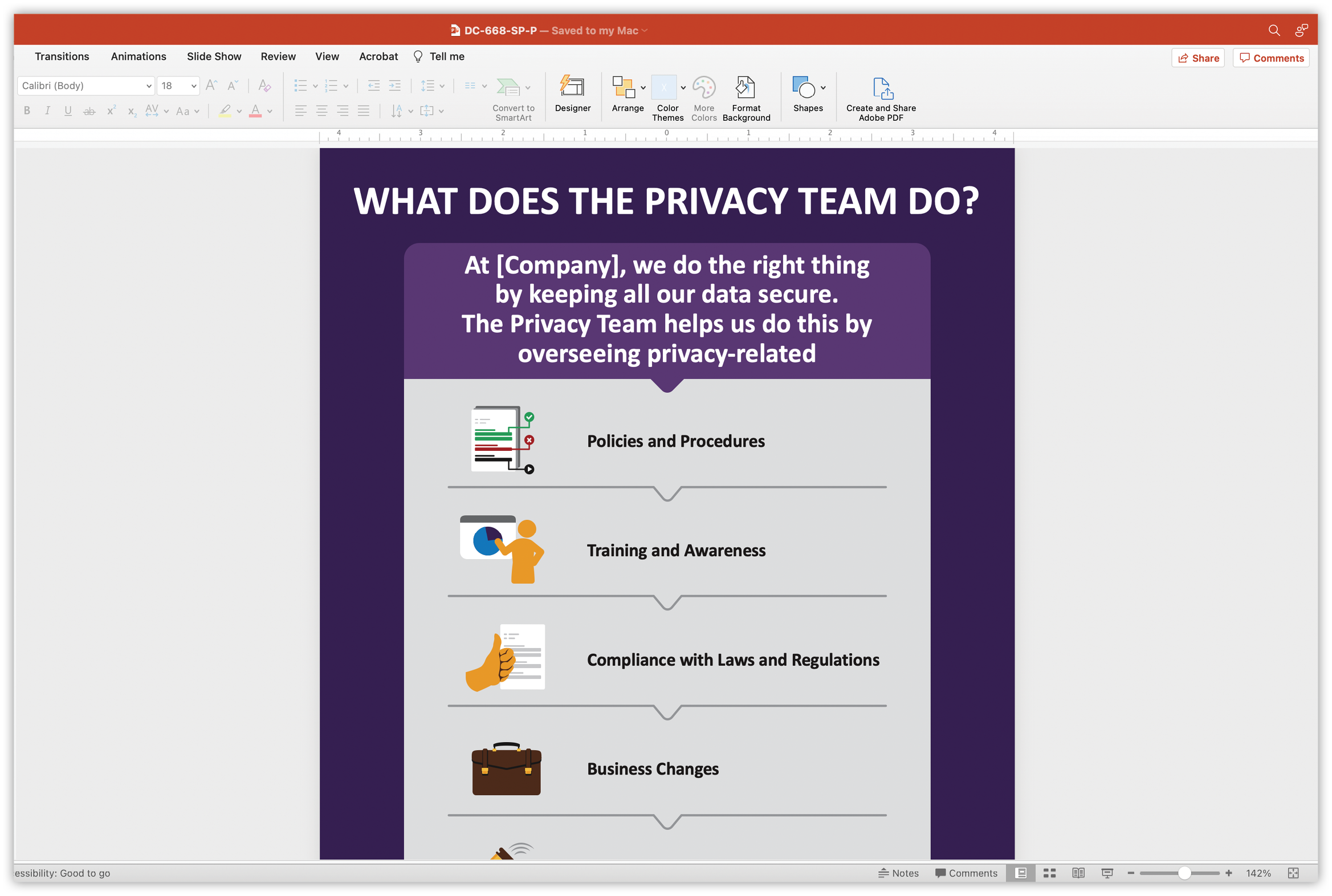
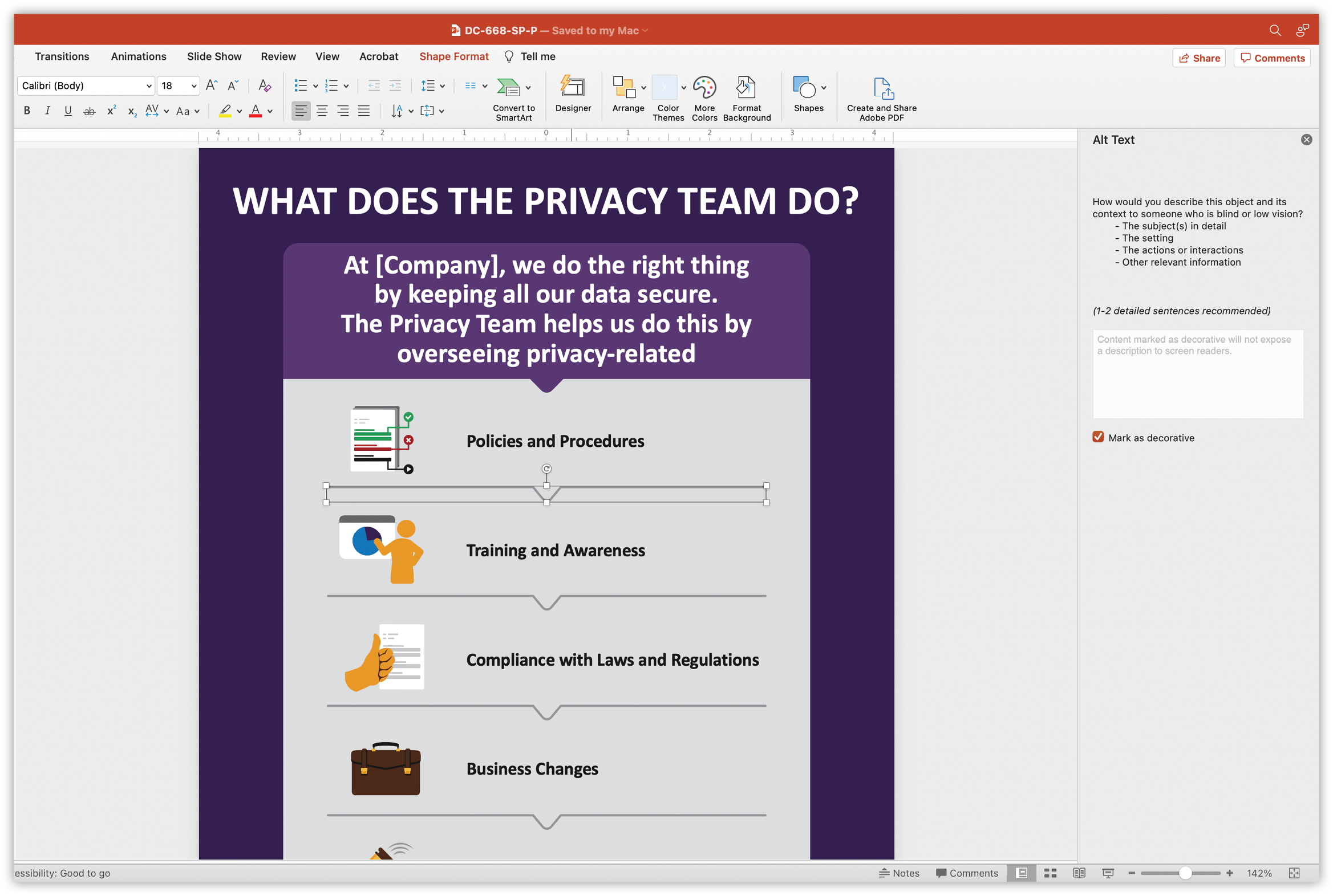
Here we’ll be using the What does the Privacy Team do? job aid as an example, but feel free to follow along with your own job aids or any PPT you may have that includes images.
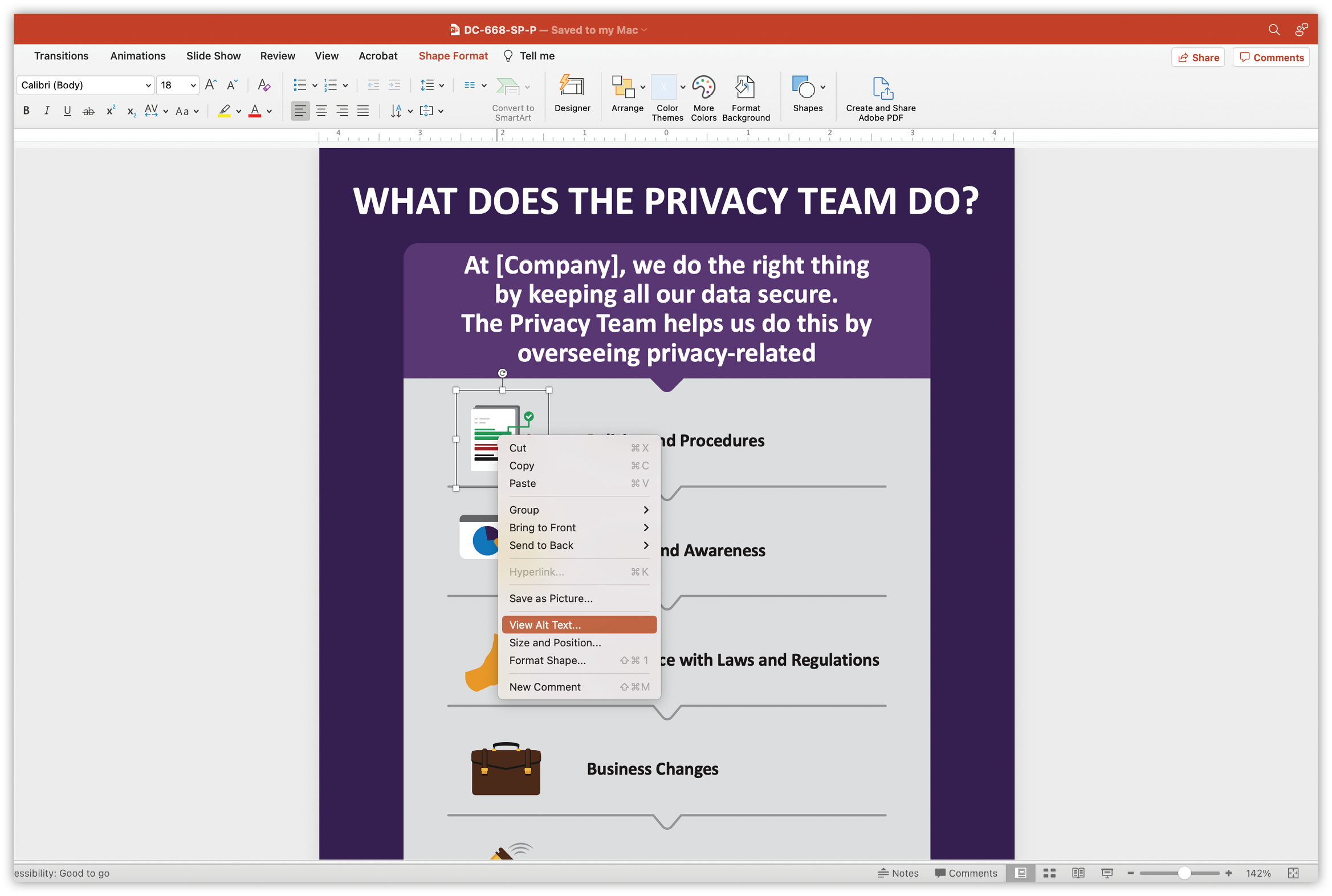
- Right-click on your image and go to “View Alt Text.”
- A menu on the right-hand side of your screen should appear. Type your alt text description into the form field. Sometimes PPT can be a bit cheeky and thinks it knows what the image is, but you can just delete the text and input your own. 🙊
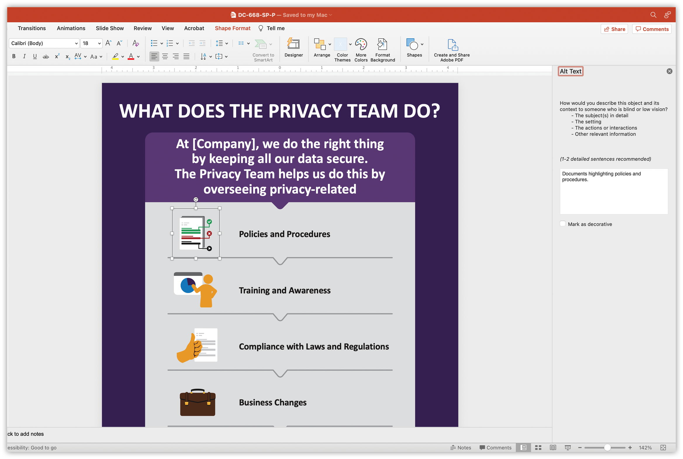
- If the image is decorative or not essential for context or information, simply check the box beneath the form field labeled “Mark as decorative.”
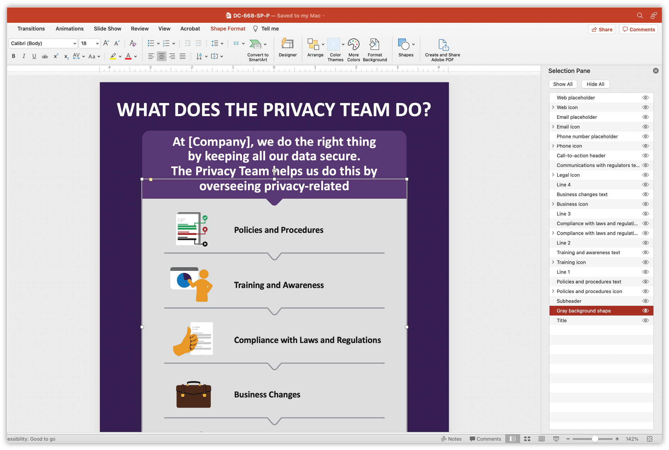
Note: If you have a grouped illustration, make sure that the overall grouping has alt text, but each individual element is marked as decorative. PPT can be sneaky and try to invent alt text for individual elements when it has no business doing so. You can select each image individually or mass-select them in the Selection Pane and mark them as decorative, but we’ll get to the Selection Pane in a moment.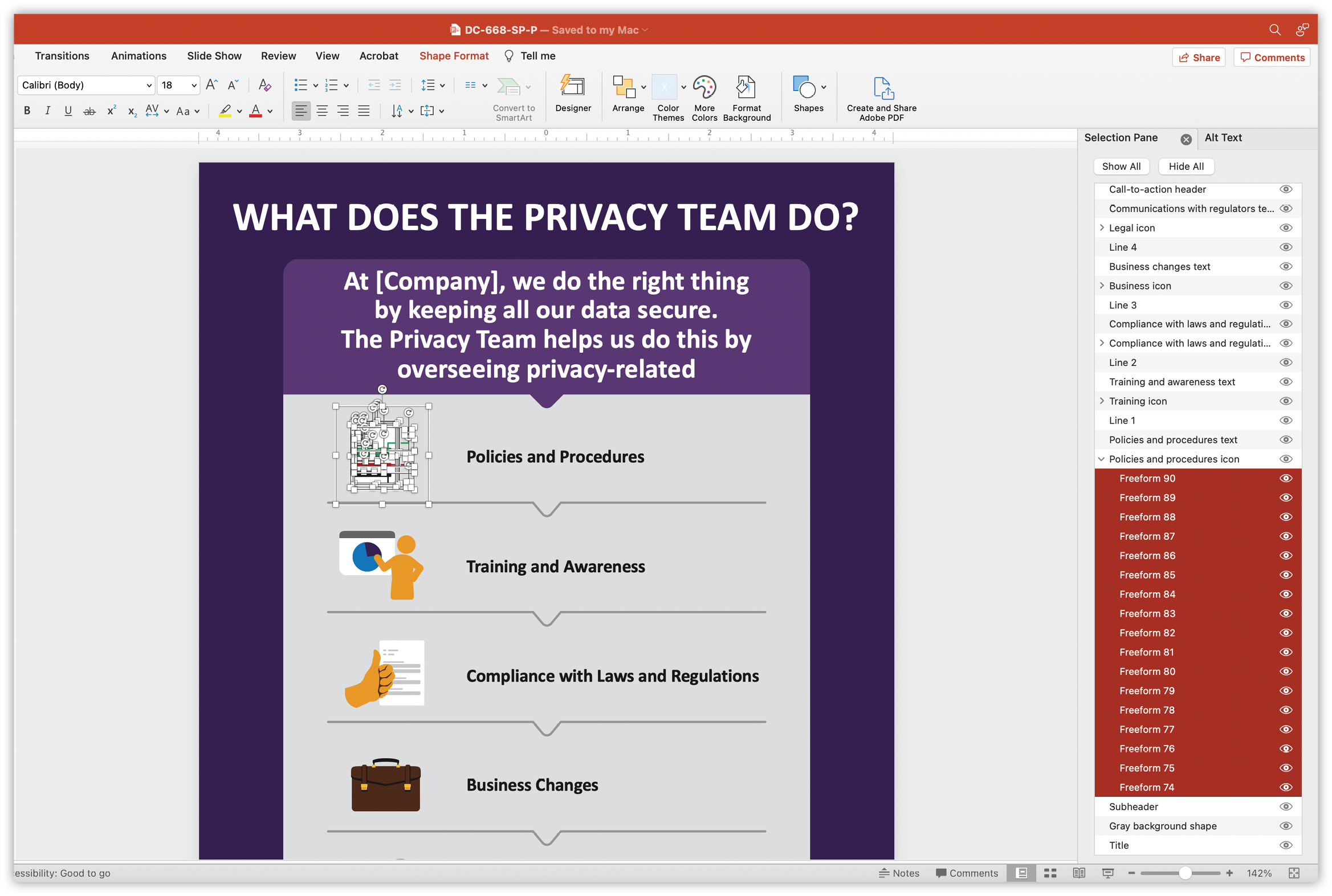
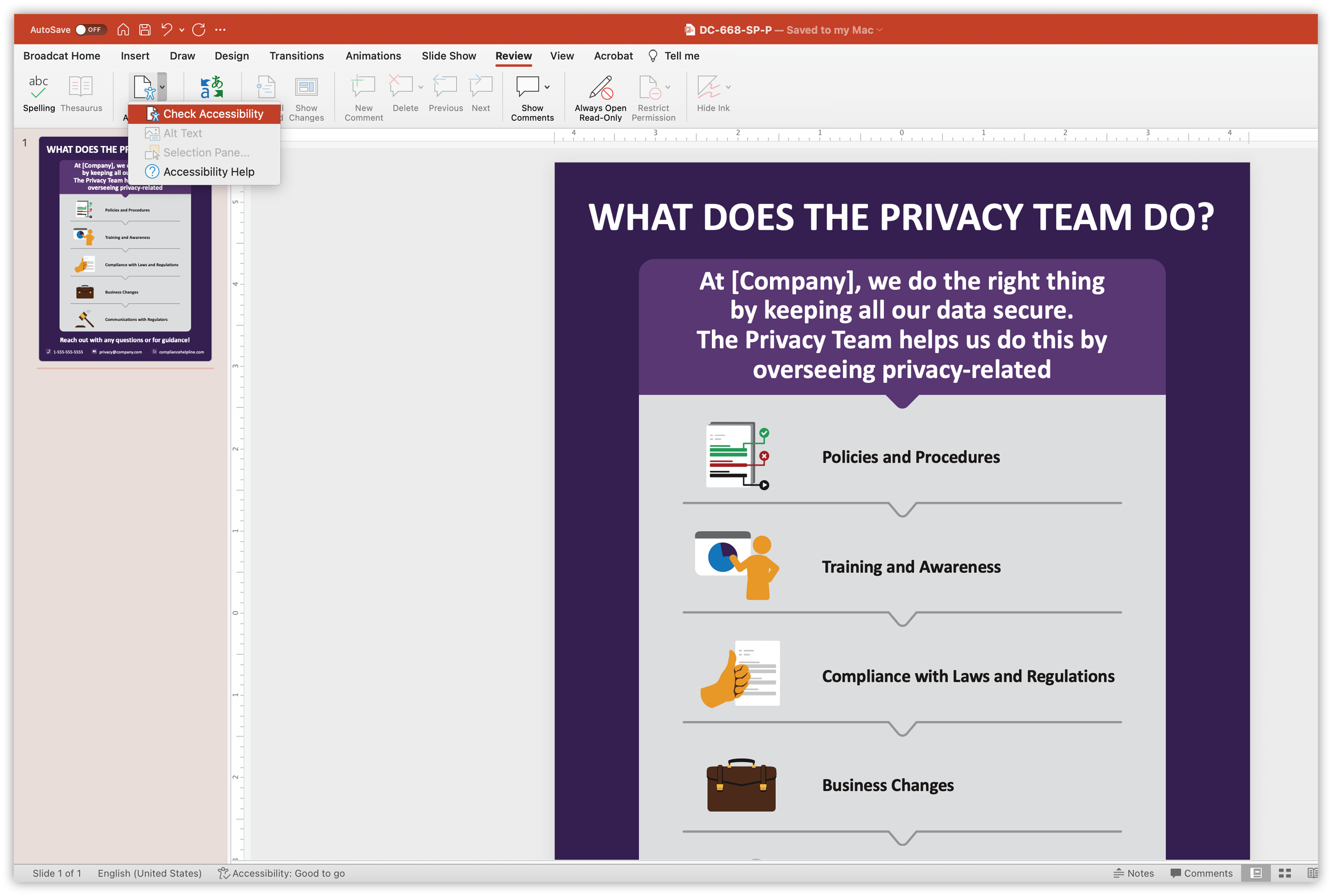
- Rinse and repeat for every graphic in your PPT. If you missed one, don’t worry! Simply go to Review>Check accessibility, and PPT will flag any graphics you may have missed. ✅
There’s one more vital step to make sure that the screen reader will read your text and graphics in the order you intended, and that’s to check the reading order.
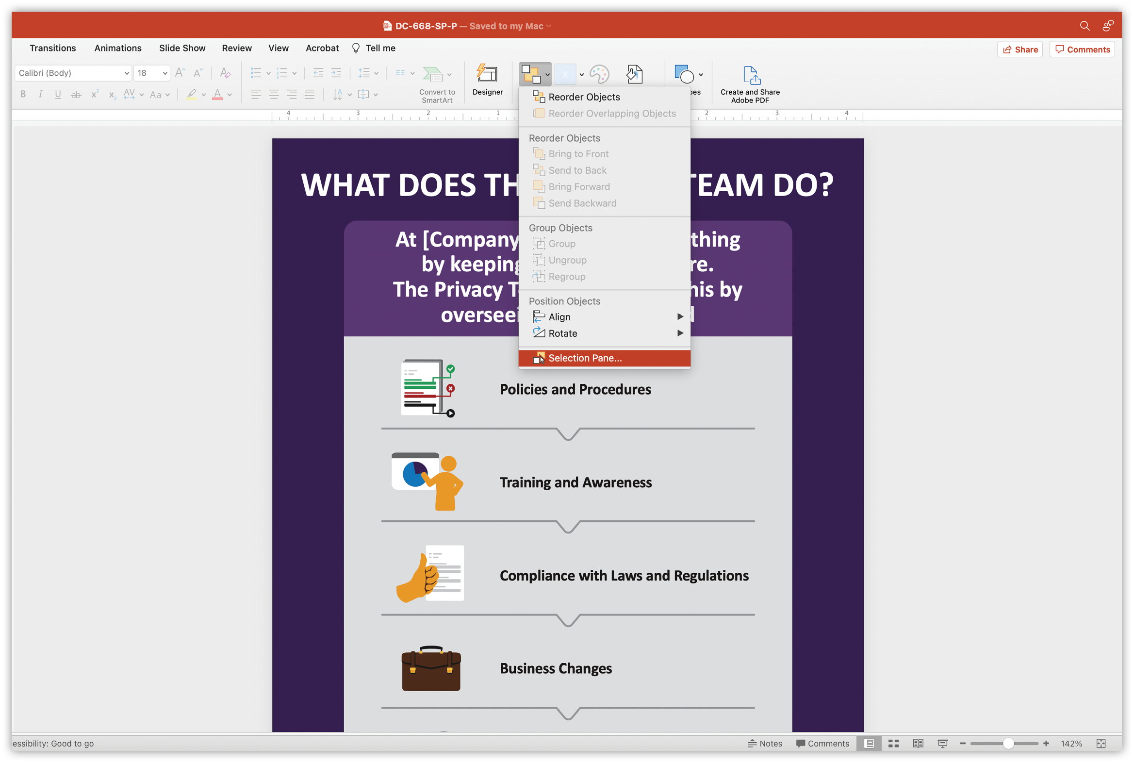
- Go to Arrange>Selection Pane…
- A list of all of the objects, text boxes and graphics should appear on the right-hand side of your screen. I've renamed the objects for this example, but ordinarily the list will label them things like "Graphic 1" or "Picture 125," etc. Make sure that what needs to be read first is at the bottom of that list and that what needs to be read last is at the top of the list. For example, the title of this job aid is going to be at the bottom of the list so it can be read first, and the contact information is going to be towards the top.
Disclaimer: This may seem counterintuitive, but it's how PPT has been set up to read the objects via the Selection Pane.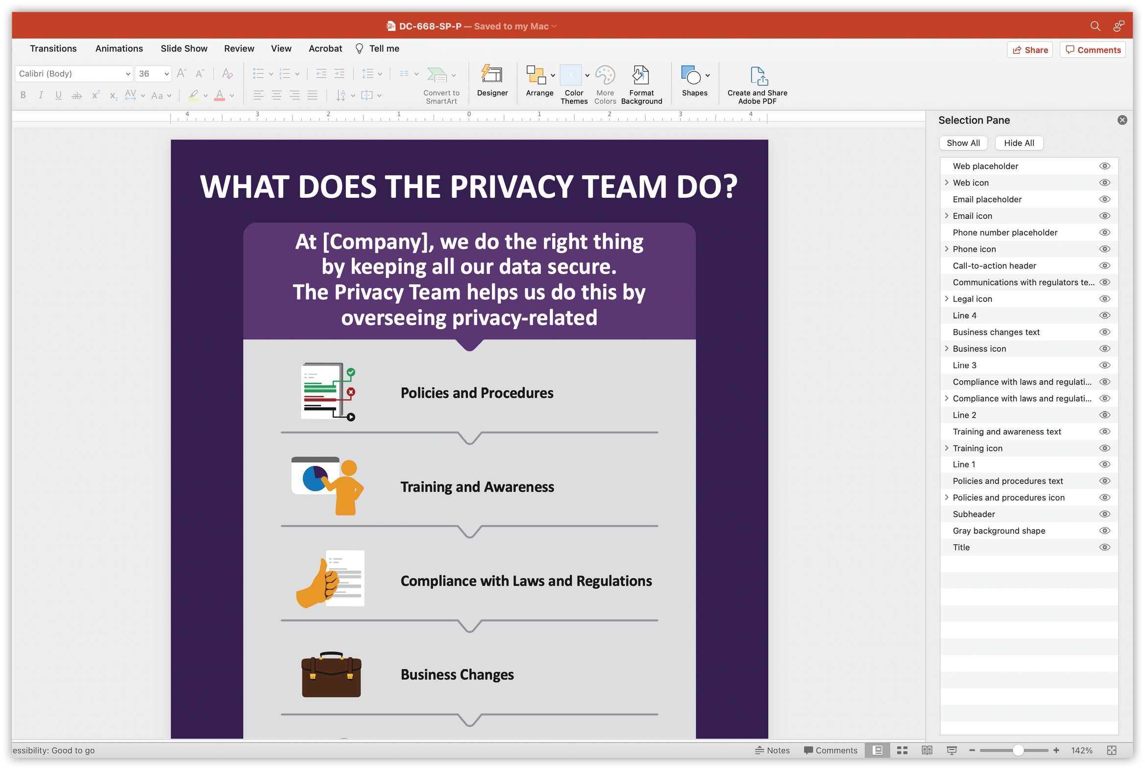
- Keep in mind that rearranging the order of the list items can also change how they overlap, so make sure any background element is listed lower on the list than the text that rests on it. In the example below, the "Gray background shape" is listed lower than any of the elements that overlay it.
Using alt text can take some practice, but taking the extra time and effort goes a long way to making sure that your content is accessible to—and usable by—everyone!
Can’t get enough of this superhero of accessibility? We’ve got you covered with an entire collection of articles on alt text on the blog