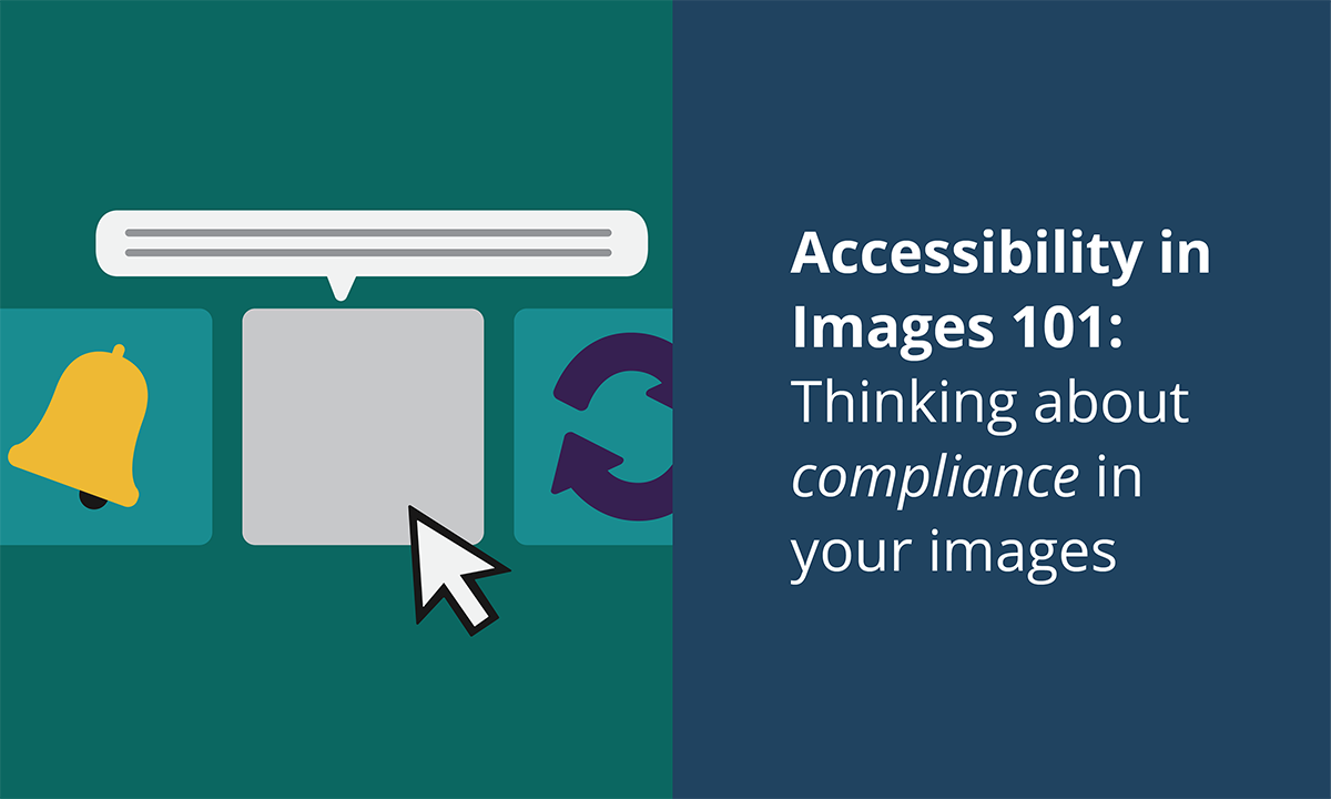

At Broadcat, it’s no secret that we 💜 love 💜 using images and graphics. They’re super useful to give a topic additional context, and they truly make everything better—but only when you’re thoughtful about using them. Consider this situation:
You open an email from a friend labeled “birthday party invite” … and it’s blank – a white box with nothing in it. Then you select “download images.” And you see it: Neon pink Comic Sans text on a canary-yellow polka-dot background with teeny-tiny RSVP info that you struggle to read.
And you feel like you’ve just burned your retinas by looking straight into the sun. 😵☀️
And this, folks, is why we want to make sure we consider accessibility when it comes to our images. We want them to be approachable and easy to understand, and we also want to make sure that those of us with various visual impairments and anyone who uses assistive technologies – like screen readers – can experience our images as best as possible.
To that end, we have some top tips to make sure you’re doing The Right Thing when it comes to having a compliance-driven mindset, even in graphic design (because, hi, all our stuff is editable 👋).
Lesson 1: Color Contrast
We all know what contrast is (our whole do this / not that series are all about contrasting examples), but when it comes to color, it gets very specific: Color contrast refers to how well we can tell the difference between two colors.
And here’s where it gets even more technical: There’s a ratio! White on white is 1:1 (no contrast); Black on white is 21:1, the highest contrast.
For most situations, you want a ratio of 7:1. Here’s where you can figure out if you’ve hit that ratio.
Here’s an example of great contrast :)
And bad contrast :(
Lesson 2: Vibrating Colors
Have you ever noticed that there are certain color combinations that just feel kinda uncomfortable to look at, like an assault on the eyeballs? 👀 That’s what we in the design game call “vibrating colors.”
More technically speaking, vibrating colors are on opposite ends of the color wheel but have very close contrast.
But, like, you’re not a designer (probably), so you don’t have time for that. Just trust your gut. Instinctively, you know that this just doesn’t work:
Oh no!! What have I done?? (contrast ratio of 1.61)
But this does:
Much better. (contrast ratio of 3.89)
See that? Same color families (we’re still looking at shades of red and green), but an improved visual experience.
Lesson 3: White Space
White space is ANY space between images. (It’s also called "negative space" because, like, if you have a purple background, it's not really white, is it?)

The term comes from book design, which is usually on white paper.|Source
White space is like a visual pause: When you speak, you pause for effect; When visuals are doing the speaking for you, white space is the pause for effect.
That’s also kinda why Apple ads work so well. Take a look at this ad; the negative space allows the main event—the MacBook Air—to shine (just watch the first 15 seconds):
In fact, Apple ads have been so effective, that nearly every technology company has applied these principles.
Lesson 4: Font Size
Unlike those broadly applicable color rules, this one depends on context. Handouts like PDFs shouldn’t rely on larger fonts, while posters and other large-format content can get away with larger sizes. Like, imagine if you went to a restaurant and the font size was so huge that the menu had 10 letters for every page… that would be impossible to read.
And because we know our audience, there are even some solid compliance reasons for using appropriate font sizes. Did you know that the ADA has guidelines on how to handle fonts? (Companies have even been sued for ADA non-compliance on their sites.)

If you’re at a loss for what font size to use, here are some general guidelines:
- If you’re printing individual handouts, don’t fall below a size 10 font.
- If you’re text will live in a digital space (like a website or e-newsletter), keep the font size at 16 or higher.
- Of course, if you’re using specialty fonts, you might have to adjust the minimums accordingly. (Also, just try to avoid specialty fonts. 🚫 )
 Contrast, negative space, font style and size, amount of space between lines and letters… all perfect. All iconic. | Source
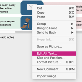
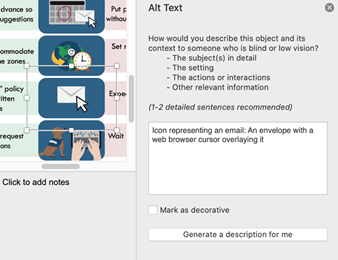
Lesson 5: Alt Text
This is probably the only non-design design element of this post… Which means it’s super important! Alt text is short for “alternative text,” and screen readers/assistive technologies use alt text to describe images.
Have you ever opened an email and instead of seeing a logo or header image at the top, it’s a box with “company logo” written in it? That’s the alt text: If an image doesn’t load, or if for any reason you’re unable to view the image, the alt text will tell you – or your screen reader – what’s supposed to be there.
📣 Alt text is especially important for images with text. 📣 If there’s no alt text, the image’s message won’t register with the screen reader, which is super problematic for anyone who uses a screen reader and/or other assistive technologies.
OK, great, but how is this done? Here’s how to do it in PowerPoint:
Lesson 6: Try It Yourself!
We love good design, and we love it even more when y’all use our creations to make your own! Try substituting our colors for your company’s branded colors. If you’re using icons, try playing around with the white space between them.
 The possibilities are endless! | Source
But honestly, if you look closely, you can see how the Broadcat designers give a lot of thought to everything we do – so that you don’t have to stress out about changing things too much!
And if you’ve made any one of our designs your own – from checklists to decision trees, infographics to screensavers (you name it!), we want to see your masterpiece! Tag us on LinkedIn. We love to know what you’re working on.

Join Compliance Design Club today and equip yourself and
your program with simple, thoughtfully-designed tools
that make compliance simple for you and your employees.